Brand Identity / Visual System
Sola Studio
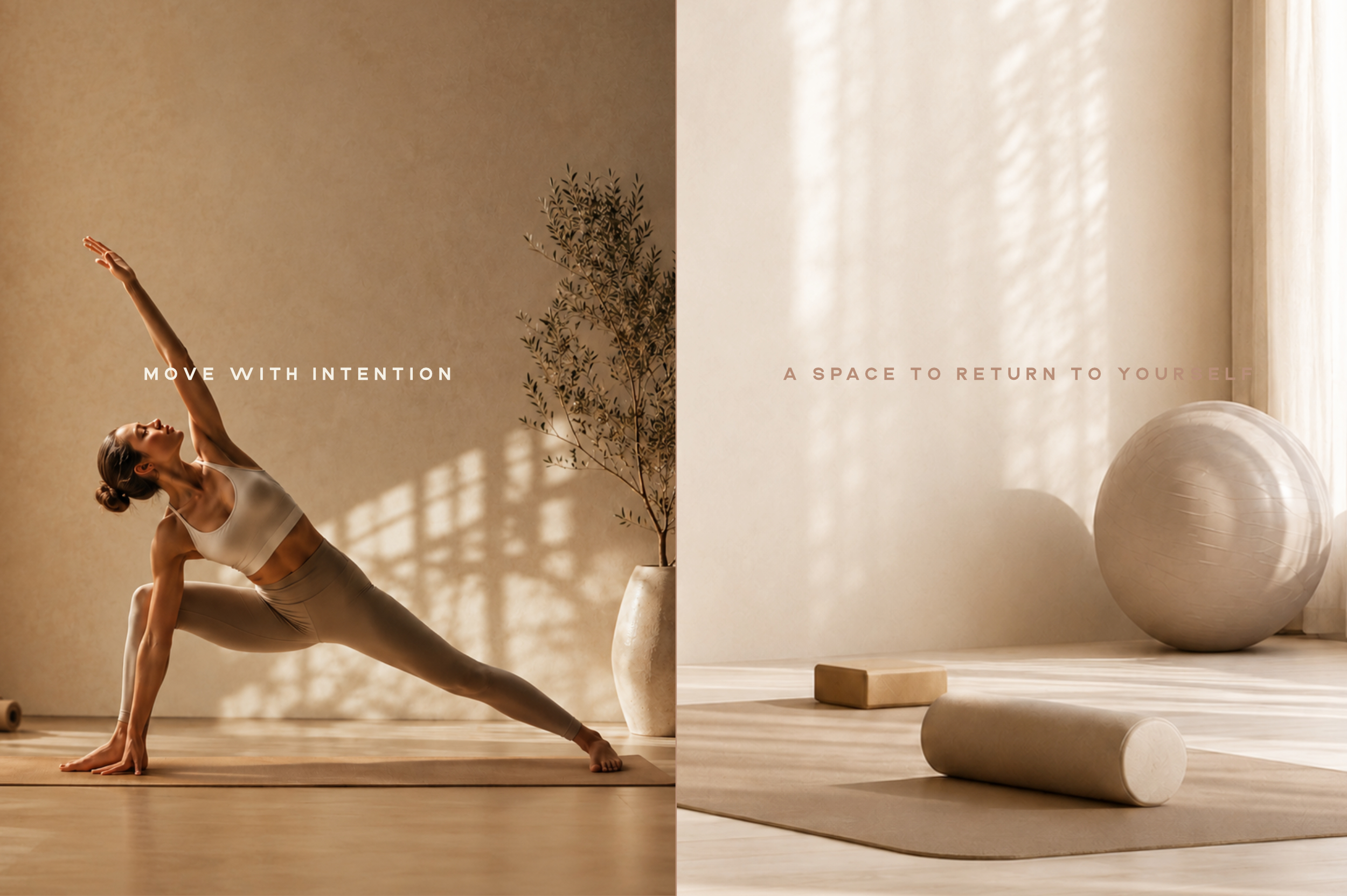
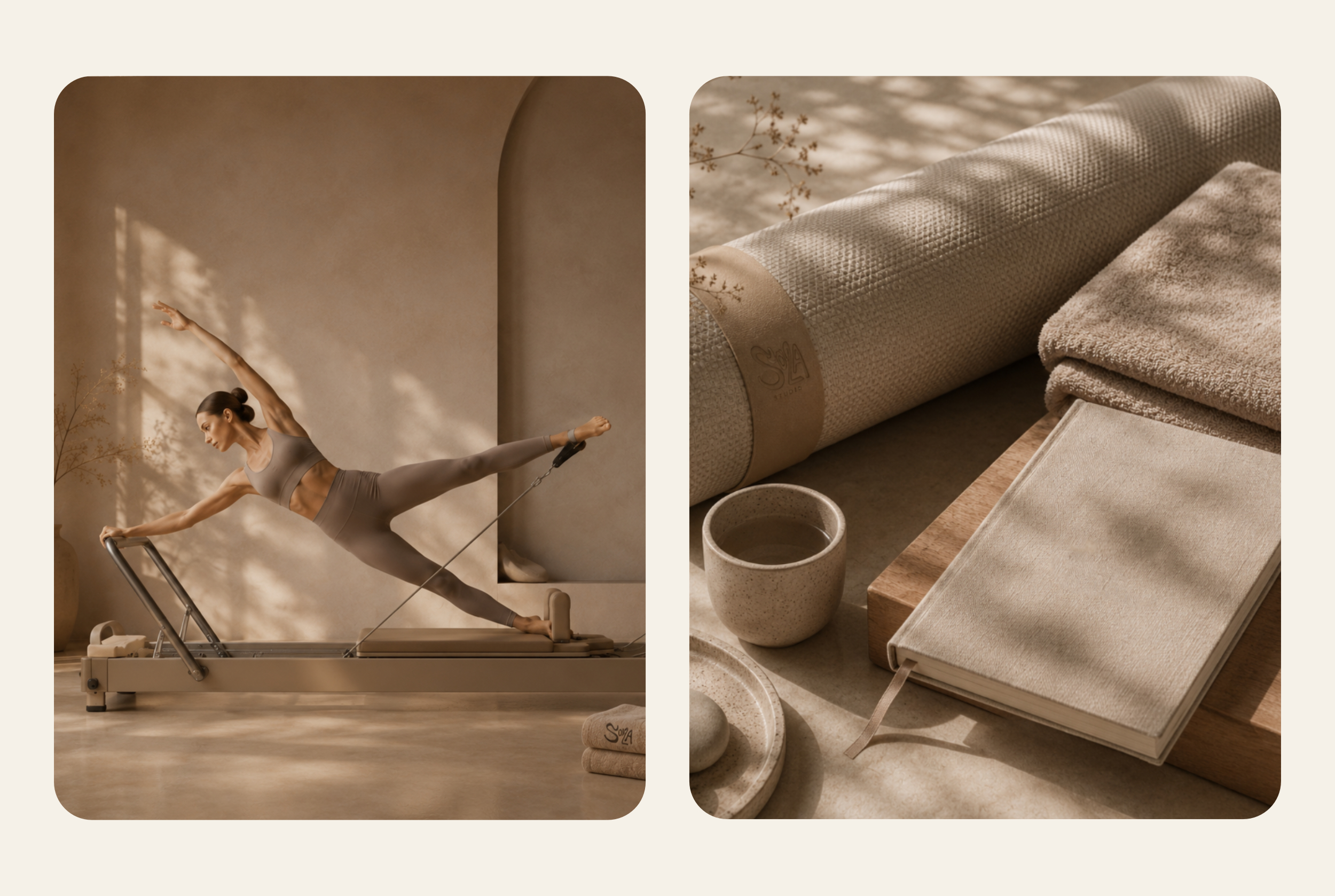
SOLA is a premium yoga and Pilates destination for people seeking balance and movement. Reza shaped its identity around motion in the SOLA letterforms: the O becomes a head while the L shifts into a body and gesture. The system carries that movement through illustration, motion, iconography, environmental graphics and digital interaction.
Challenge + direction
Make movement specific to SOLA.
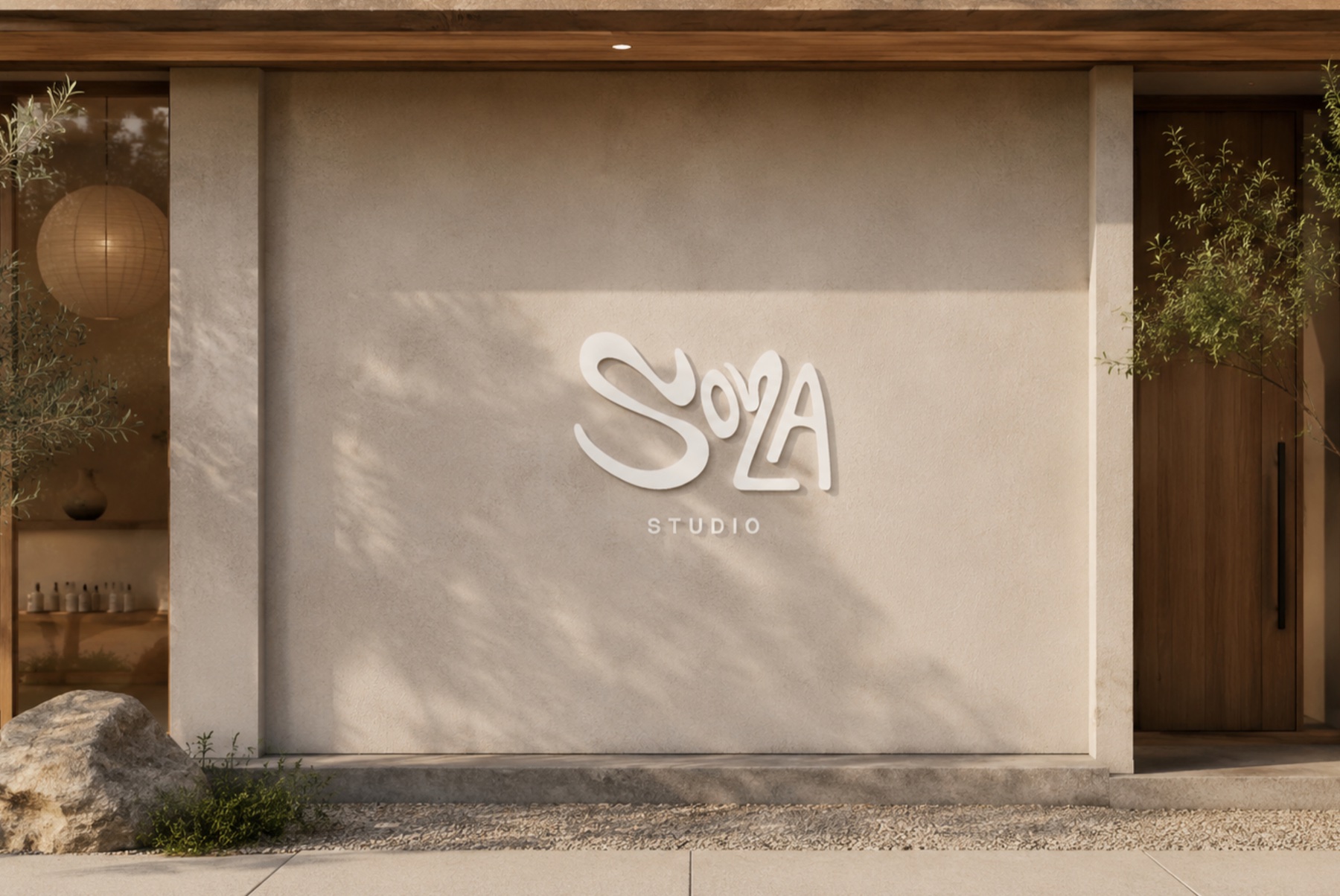
Yoga identities often reach for familiar symbols such as a lotus, meditation pose, sun or perfectly balanced circle. SOLA needed a more specific starting point. The O could read as a head and the L could shift into a body; angle and proportion let the figure stretch while the word remains legible.
Brand system
Movement becomes the identity system.
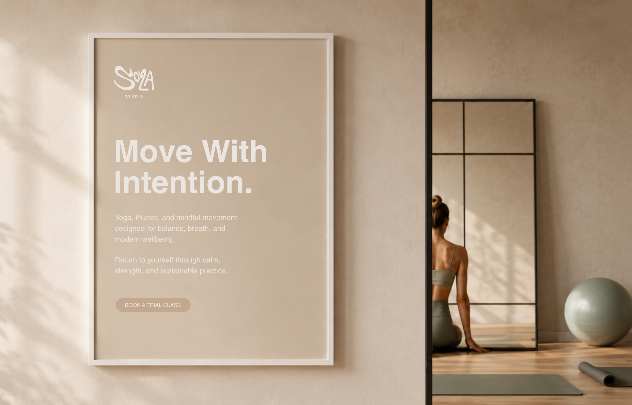
The O reads as a head while the L shifts into a torso, arm, leg or line of motion. Four principles guide the system: Ritual, Tension, Tempo and Threshold. They shape illustration, motion, iconography, environmental graphics and digital interaction, keeping the identity connected as its gestures change across applications.
Key decisions
Result
The identity embeds movement in SOLA’s letterforms and gives it four principles for consistent use across illustration, motion and applications.
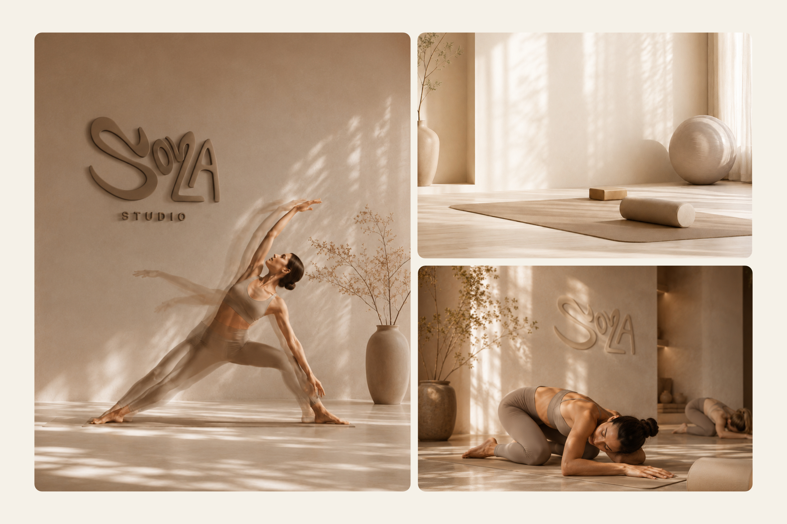
Movement stays expressive because its boundaries are clear: each gesture changes, while the SOLA letterforms remain recognisable.