Mark at small scale
The identity stays distinctive when reduced, so recognition can travel from a sign or menu to a small social placement.
Brand Direction
This cafe and eatery identity explores a warm but restrained hospitality personality through an architectural mark, deep neutrals and contemporary applications. Reza directed the logo and visual language so the place could feel recognisable across signage, menus and social templates while food, material and place carry the mood.

Challenge + direction
The identity needed to feel specific to the place across signage, menus and social content. A logo and colour palette alone would have made the cafe generic, so Reza built recognition through an architectural mark, restrained type, deep neutrals and applications that leave room for food, material and atmosphere.
System / execution
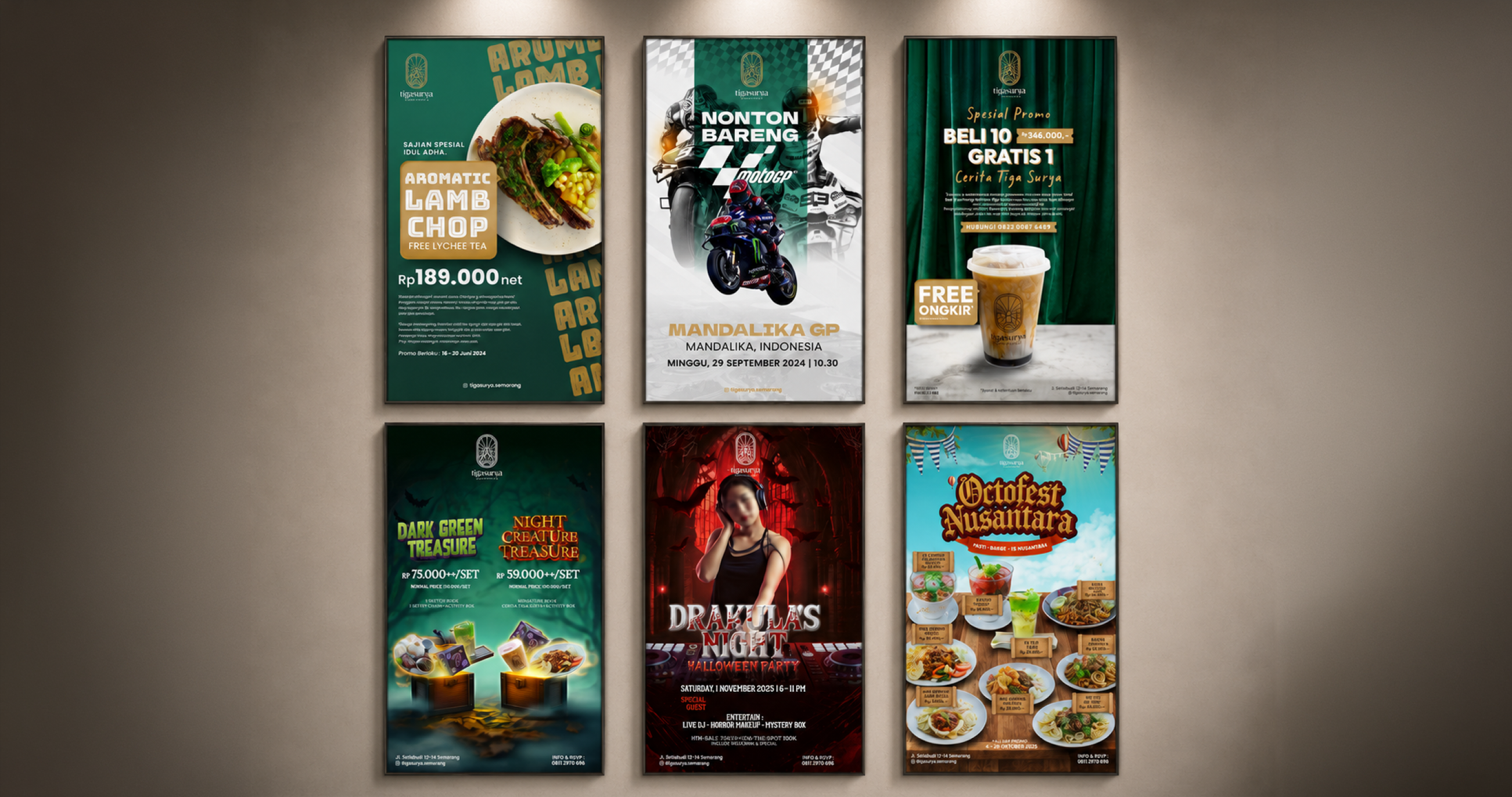
The mark, typography and image treatment work together across signage, menus and social templates. The identity stays distinctive at small sizes, while deep neutrals and restrained composition create the contemporary hospitality mood without adding ornament that competes with the food or the place.
Key decisions
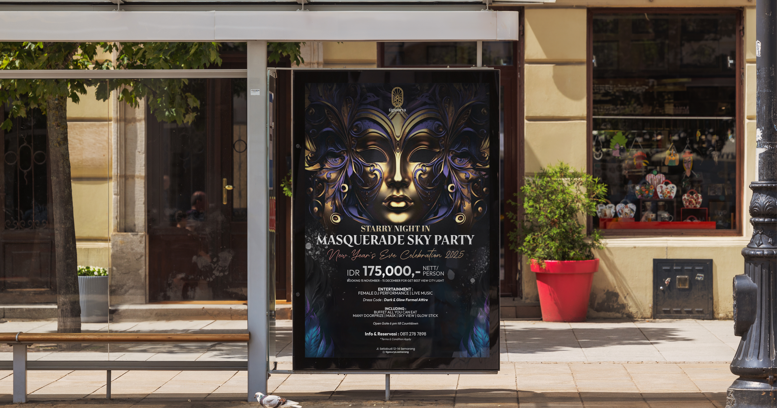
The identity stays distinctive when reduced, so recognition can travel from a sign or menu to a small social placement.
Deep neutrals, restrained type and composition create the contemporary hospitality mood without adding decoration that competes with the place.
The mark, typography and image treatment repeat across print and digital applications so the identity feels like one place.
Result
A strong hospitality identity should feel present without competing with the reason people came in.